Tag Archives: design

Keys to Success in That Project / Process / Disruption You Want to Introduce

US Digital Response is a nonprofit that leverages a network of pro bono technical expertise – volunteers – to help governments, nonprofits, and public entities respond quickly to critical public needs. As of May 2023, USDR has partnered with almost 300 government and nonprofit partners on nearly 400 projects. For instance, a state workforce partner needed to reopen applications for multilingual claimants who were previously denied benefits and determine if they are eligible to receive retroactive PUA payments. Many claimants had not interacted with the UI system in months or possibly years, causing the potential for confusion when the department reached back out to the claimant. Another concern was the increased call center activity, putting additional strain on support staff working through a backlog of cases from existing claims. To help combat these issues, the state agency wanted to create a self-guided experience that was clear for claimants as well as reduce load on their call center. USDR volunteers helped them do this.

I really like this guide from US Digital Response on how their projects work. I think it’s how all ICT projects that help nonprofits – and indeed, how all capacity-building projects, even those that do not involve tech – should work. Too often, when expert consultants, whether volunteer or paid, come into a program to create what is supposed to be a sustainable project – ICT-related or not – it never really gets adopted by the agency. That’s time and money wasted. I think following this guide can help stop that:

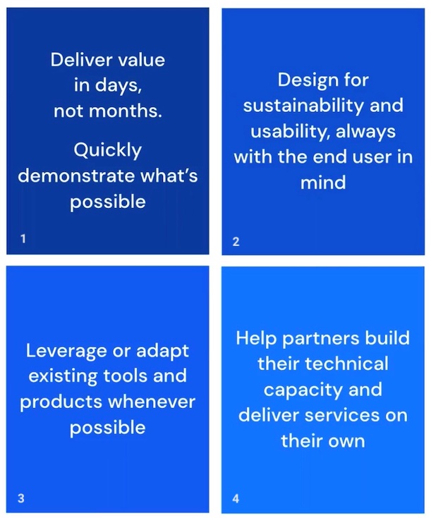
1. Deliver value in days, not months. Quickly demonstrate what's possible.
2. Design for sustainability and usability, always with the end user in mind. 
3. Leverage or adapt existing tools and products whenever possible. 
4. Help partners build their technical capacity and deliver services on their own.

Let’s take a closer look at each of these:

Deliver in values in days, not months. This isn’t possible for every project, tech-related or not. But it’s always worth thinking about: is there a small win that could be achieved early in a project that, ultimately, will take longer and will quickly demonstrate what’s possible, show why this is worth doing, etc.? If the project will take a long time, could small wins every few weeks be built into the project development?

Design for sustainability and usability, always with the end user in mind. Can I get an amen?! I feel so strongly about this, it really should be number one. To me, sustainability means that what you create can be taken over by the regular staff, whether employees or volunteers, when you, the person designing and implementing this, move on. If that’s not possible, IT’S NOT WORTH DOING. And to do this means you have focused on usability.

Leverage or adapt existing tools and products whenever possible. The first thing I do when I go into an organization is to access what they have in terms of software, hardware, forms and processes. I do NOT go in and start switching whatever they are using for document-sharing, live chat, photo-sharing with the public, donor tracking, etc. The organization MAY have all that they need – they just need to improve how they use it.

Help partners build their technical capacity and deliver services on their own. This, to me, links back to my comment about sustainability.

Of course, all of this is easier said than done. The biggest thing that has affected the success of my own change-based projects at an organization is a leader suddenly changing their mind about what they want and retreating into the but that’s the way we’ve always done it mentality. A lot of people say they want a change, or something new, but then balk when they see what that is really going to look like. I’m not sure what the process is to diplomatically ask, “You say this is what you want – but do you really?”

Also, I am always fascinated how a staff person or volunteer can have an idea for a new way of doing things and it’s rejected outright – but a consultant can suggest the same thing and it’s immediately endorsed and implemented. Before your organization looks for outside expertise, take an honest look inside – you may already have the inspiration, talent and energy you need among current staff.

Also see:

If you have benefited from this blog or other parts of my web site and would like to support the time that went into researching information, developing material, preparing articles, updating pages, etc. (I receive no funding for this work), here is how you can help.

Taking control of your web site when you aren’t the web master

Most web masters at mission-based organizations – at nonprofits, non-governmental organizations (NGOs), government agencies and schools – want to do the best job possible in creating and managing the initiative’s web site.

Unfortunately, there are situations where staff at mission-based organizations are intimidated by the people that manage their web site, to the point of being afraid to ask questions, even to ask for a change in the site. All a web master has to say is, “That can’t be done” or “that’s too expensive” or “I won’t be able to do that” and many of these staff members will not pursue an issue further. After all, the web master is the expert, right?

It is unfortunate that there are so many web masters that take advantage of their expertise and will use it to claim certain things cannot be done on a web site when, in fact, they can be done. Perhaps they don’t see it as a priority and don’t want to do it. Perhaps they don’t know how and don’t want to admit it. Whatever the reason, it holds a lot of organizations back from doing all that they should with their web sites, like making them designed for their particular audiences, or making them accessible for people with disabilities.

Here are things staff at mission-based organizations can do to set a tone with IT staff regarding who has input into web-related decisions, including design:

1. Ask your web master what company hosts your organization’s web site, how your domain name is registered, and for all passwords. Your web site should be hosted by a reputable company in the business of hosting web sites, not the web master’s side business or through a company he or she has a “special deal” with. You can look up your domain name registration here and make sure it’s registered in such a way that your organization owns it, not your web master, and that it matches what your web master tells you. You need all of the passwords associated with the web site in case the web master leaves.

2. Ask your web master what the 10 most visited pages are on your web site are. This is a very easy question to get answers for, and there should be no reason for your web master to hesitate to provide this information. 

As you review the data he or she provides, ask yourself, the web master, and other staff member these questions:

  • Is there a page on your web site that is more popular than the home page? Why is that?
  • Are these the 10 pages you want to be the most visited on your web site? If not, what should you do to increase the number of visitors to the pages you most want users to visit?

Don’t just think about increasing visitors to certain pages. Sure, you could get more people visiting your donate to us page if you made it your home page, but would it increase the number of donations your nonprofit gets? No. Think about what you want to happen as a result of people visiting your web site, what you want users to do as a result of navigating around your web site, and remember that different people will have different wants regarding your web site. Have your web master in on these conversations, so he or she can understand your organization’s communications priorities, which program staff should set, not the web master.

3. Invite volunteers to your conference room and have them navigate your web site with their own laptops and smart phones. Have the web master there to observe. Ask the volunteers to find information on how to volunteer, and quiz them on what they found. Ask them what donations pay for at your organization, based on what they found on your web site. Ask them what difference your nonprofit makes, based on what they found on your web site.

Take notes on their answers and then have a followup meeting with communications staff, including the web master. Talk about what you learned from this feedback, and either develop a plan on how to adjust your web site so that it does what you want it to do, or ask your web master to develop such and then present it to staff.

4. Six months after the changes have been made to your web site, do steps one and two again. Are the top 10 pages visited on your web site the pages you want most visitors to see? Are volunteers able to more easily find information about how to volunteer, what donations pay for, what difference your nonprofit makes, etc.?

5. When you want a feature on your web site, find an example of it on another web site, particularly at a company or agency about the size of your organization. Have this ready to show the web master, to prevent the “that can’t be done” argument.

6. Tell your web master which staff members need to be able to make simple text changes without his or her support. Whomever is in charge of communications at your organization should have this ability. Maybe you want a small group of reliable volunteers with some web design experience who can step in to do such when the web master is not available. And then have your web master show exactly how those staff members should make those changes via whatever content management system he or she prefers. Maybe there is a WordPress interface. Maybe there is another type of interface (I use BlueGriffon). The point is that you should never have to wait for the web master to make time to merely add a paragraph or two to a page, or to correct a typo.

These six simple things will let you take back control over your organization’s web site, and help you have the documentation you need for when your web master moves on – and your web master WILL move on!

Also see:

If you have benefited from this blog or other parts of my web site and would like to support the time that went into researching information, developing material, preparing articles, updating pages, etc. (I receive no funding for this work), here is how you can help.

Universal accessibility in tourism! World Tourism Day theme 2016

tourismforallWorld Tourism Day is September 27 each year, as designated by the United Nations General Assembly, and is meant to foster awareness among the international community of the importance of tourism and its social, cultural, political and economic value. The celebration also seeks to highlight tourism’s potential to contribute to reaching the Sustainable Development Goals (SDGs), addressing some of the most pressing challenges society is faced with today. The lead agency for the day is the UN World Tourism Organization, and the theme of this year’s World Tourism Day is “Promoting Universal Accessibility.”

Accessible Tourism for all is about the creation of environments that can cater for the needs of all of us, whether whether we are traveling or staying at home. May that be due to a disability, even temporary, families with small children, or the ageing population, at some point in our lives, sooner or later, we all benefit of universal accessibility in tourism.

Which is why we want to call upon the right for all of the world’s citizens to experience the incredible diversity of our planet and the beauty of the world we live in. 

LOVE the theme. The organizers are offering a free publication, UNWTO Recommendations on Accessible Information in Tourism (2016) , in English and Spanish. I love this from the introduction of that publication:

Tourist information needs to be designed based on the principles of Universal Design in order to maximise its ease of use by as many people as possible and in varied environmental conditions and situations. This applies equally to print media, graphics and  digital communication formats. No one should be excluded from participating in tourism activities because of poorly designed information tools and systems, as this also implies being excluded from the opportunity of living an independent life.

I am SO pleased to see this emphasis from a United Nations agency! Accessible design for web sites and smart phone apps is a very, very big deal with me – and if you need help with accessible design, there’s no better place to look than the Austin, Texas-based nonprofit Knowbility!

The campaign also has UNWTO Recommendations on Accessible Tourism for All (2013), to advise on ativities for ensuring that people with disabilities have access to the physical environment, the transportation system, information and communications channels, as well as to a wide range of public facilities and services. There are lots more free UNWTO publications regarding accessibility in tourism, as well as logos in English, Spanish, French and Russian in association with this year’s theme,

If you are having an event in association with this theme on World Tourism Day, you can submit it via the web site and it will appear on the official map.

And in case you are wondering why I care so much about this particular day: I’m an avid traveler. I want to use my privilege to see different parts of the world, whether that’s something around the globe from me or in the next county. Travel gives me hope in humanity, because of the incredible kindness I experience. Travel gives me a sense of wonder, because of the incredible natural beauty and human-made marvels I see. Travel gives me a sense of brotherhood with all humans, because of the various representations of history I encounter. I want all people to get to experience this, particularly women. And the economic benefits to local communities regarding tourism are real and something I very much want to support.

Also see Adventure tourism as a tool for economic & community development by me! This is a resource for those that like to explore developing countries / low infrastructure environments, as well as offering more about why I make travel a priority in my life.

(my own blog)

How Yahoo could THRIVE

Yes, this nonprofit management consultant is going to offer advice for a for-profit company on the ropes. I know it’s usually the opposite – corporations tell mission-based organizations – nonprofits, government agencies, schools, etc. – how they should do this or that. But there’s a LOT the for-profit world can learn from the mission-based world – and from very average computer users. And I’ve been a long-time Yahoo user – and have found myself migrating to other services, particularly over the last five years. Yahoo should listen to me!

Your mission

Let’s start with that word mission. Yahoo, what is your mission? Why do you exist, beyond to make money so you can pay staff and shareholders? I don’t know what your mission is. You need a clear mission statement that guides every business decision you make – and keeps you from engaging in activities that get you as muddled as you are now.

Yahoo home page & news search site

Let’s look at the Yahoo home page or the Yahoo news site in comparison to, say, your arch rival’s, Google’s home page or the Google news site. What I see when I look at your pages: a bloated mess. What I experience: memory-hungry sites that take forever to download unless I’m on the very best computer, sites that like some browsers but not others. Sites that seem to have no reason behind the design – my eye has no idea where to go. The experience is frustrating and confusing.

Your guiding principle in your redesign should be quick to download. Put posters up all over your offices that say lightening-fast to download. Test and retest the design on a variety of devices and operating systems. Download speeds need to be lightening fast for everyone, not just those with incredibly fast Internet connections and using the same tools as your web designers.

Your news site search also seems to be broken, and has been for many, many months: I’ve often heard breaking news on TV, or want to look up the results of a sports event that has been over for a few hours, even 24 hours. I’ve used your search site to find those results, and the results are, more often than not, not the latest. I’m tired of looking up the results of a game that’s long over and getting back stories published the day before the game ever happened. I go to Google and get the results I need. So – FIX THIS.

That said, the results page for your news site search has the kind of design the rest of your site needs: simple, easy to navigate, easy to read.

Yahoogroups

Yahoogroups is a far superiour platform for online discussion groups and online collaboration than LinkedIn groups or GoogleGroups. The web interface is much easier to read and navigate than those platforms – although it could use a refreshing upgrade (but not anything that will make it more bloated in terms of bandwidth!). I cannot count how many times someone tells me they need an online tool that will allow them to collaborate with remote staff or students, or allow members of a project to share a calendar, have a shared but publicly-private message space for a group or class, and various other features – when they say they want a basic cloud-based, file-sharing platform – and when I show them YahooGroups, they say, “This has everything I need! How did I not know about this?”

How did they not know about YahooGroups? You don’t advertise it. I’m a better advocate for this service of yours than you are!

In addition to all the advanced features, YahooGroups allows for group members who do not want to join Yahoo to receive and respond to messages via email – and, like it or not, there are still millions of folks who prefer to interact with online groups that way. That’s a major draw to YahooGroups among some folks I work with.

Push Yahoogroups! Have people talking about it at conferences and on various online fora where people are asking, “Where can I find a group that does this and this and this?” Advertise it on TV. Highlight organizations, families, and other groups that love it oh-so-much and are using it for so many different reasons.

Want to make money with it? I would happily pay a monthly fee to get rid of the advertising. I’m not alone. Offer an affordable rate – say, $100 a year – for a group to have all ads removed from the web site and from emails sent from the group. I’d pay that for my group, which I use to distribute my newsletter, Tech4Impact.

Yahoo IM

Interesting that most people I work with also have Yahoo IM, and have for years. Since my colleagues all use cross-platform IM tools (I use Adium), what platform we all have should be moot, yet so many of us are still on Yahoo. But that could change. Are you going to keep Yahoo super-simple to use and integrate with other IM platforms? Are you going to make it the fastest and most reliable, or are you going to bloat it up with features that will eat up bandwidth?

Yahoomail

I have my own domain name and, therefore, my own custom email address. Yet, I also have a Yahoomail account too: I like using it for ecommerce (for anything I buy online) and the spam filter rocks. And the text isn’t as tiny as Googlemail – and I’m so tired of tiny online text. Advertise Yahoomail!

Shine

Get rid of Shine. Or radically alter it.

I don’t want advice on shoes (unless it’s advice for motorcycle boots), I don’t read horoscopes and loathe any publication that thinks it’s what women want, and I need advice for saving money that has less to do with bargains at department stories (how to get that designer look for less!) and more to do with how to save money on utility bills, water bills, rent, gas, etc. Movie news is fun – but I would prefer information about the best places to go in Canada or Mexico for single women travelers, how to get started kayaking in my 40s, the realities of starting a dog-walking business, certifications offered through most community colleges that can help my career prospects, the easiest veggies to grow in a tiny space, etc. I want something that it fierce and funny and intelligent. Partner with the people behind the magazine Bust and do something that women would actually like to read every day.

YahooAnswers

YahooAnswers is NOT living up to its potential. It could be awesome. Instead, the same questions are getting asked again and again on YahooAnswers. Some version of I’m 13/14 and I want to volunteer in my hometown with animals. How can I do that? gets posted to the community service section EVERY DAY. YahooAnswers needs a FAQs, with answers. And you need to pay some experts to regularly monitor and answer questions in certain sections, to ensure people are getting quality answers. For instance, give PeaceCorps and Girl Scouts small grants to cover their staff time for spending a few minutes every day on YahooAnswers and answering questions regarding their respective organizations.

Flickr

QUIT MESSING WITH FLICKR. Photos already take up a lot of bandwidth – stop adding scripts and other “features” that make it even more bloated!

Get Personal

I never see your staff on TV being interviewd or offering commentary. I don’t hear about your staff doing something wacky, or philanthropic, or participating in take-your-dog-to-work day. I don’t see or hear them at the conferences I go to. I don’t see them hosting webinars to help different business sectors, including nonprofits, to get the most our of the Interwebs. You’re just this faceless company, a fortress, with web offerings that are, more and more, not what I want or need. I don’t see you sponsoring or participating in things like AIR events by Knowbility.

Who are you, Yahoo? How are you going to let me know who you are? Woo me, Yahoo. Woo me.

Pioneering in “hacks for good”: Knowbility

Hackathons, hacks for good, hackfests or codefests are quite the buzz words these days.

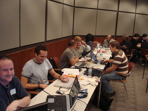
There are a lot of new initiatives getting a lot of attention for mobilizing people with high tech skills to help various causes at individual events: these initiatives bring these people together to spend the day, or maybe a few days in a week, at computers, usually in one big room, with everyone using their skills to do good, eat some good food, take lots of fun photos of everyone in action, and celebrate the great work at the end of the day.

Good stuff. But one of the first organizations to do this, Knowbility, gets lost amongst the much better-funded, higher profile newcomer groups, and it’s such a shame, because more people really should get to know Knowbility!

AIR Houston 2007

Knowbility is a national nonprofit organization based in Austin, Texas that creates technology programs that support independent living for people with disabilities, including veterans. Knowbility’s signature event is its Accessibility Internet Rally (AIR) – a hackathon that brings together teams of web designers to learn about web design accessibility standards, and then to apply those standards in a competition to create web sites for nonprofit organizations. The result of an AIR event isn’t just a fun day and new web sites; all participants walk away with an understanding of web design accessibility standards they didn’t have before that they can apply to their daily professional work, and the volunteer teams, most of them from the corporate sector, learn about the unique work of nonprofit organizations, creating opportunities for better partnerships in the future.

Knowbility’s activities have earned all sorts of awards and recognition – like the Peter F. Drucker Foundation Recognition for Nonprofit Innovation. On September 21, 2000, the White House issued a press release to highlight programs across the country that are helping to bridge the digital divide for people with disabilities and Knowbility’s AIR event in Colorado was mentioned by President Clinton as a new and noteworthy initiative. And I’ll never forget when they got mentioned at the end of Oprah’s talk show, resulting in an onslaught of emails and phone calls and oh-so-much excitement.

Knowbility earns more than 60% of its revenue through fee-for-service offerings. But that means it still relies heavily on grants and donations. Knowbility is worth your financial support. I really want this organization to continue – more than that, I actually want this organization to launch more AIR events and other activities all over the USA, and beyond! Knowbility is worth your investment.

And if you have ever been involved with Knowbility in any way, consider blogging about your expereince, talking about it on your Facebook status update or Twitter feed or Google Plus profile or other social media profile, and linking to the donation page.

Here are some other blogs I’ve written about Knowbility:

Hackathons for good? That’s volunteering!

Volunteer online & make web sites accessible

No excuses for not having the word “volunteer” on your home page!

graphic by Jayne Cravens representing volunteersKudos to the Girl Scouts of Kentuckiana for having the words volunteer and volunteers on the home page of its web site, thereby showing immedately the value of volunteers in their efforts. The vast majority of programming that Girl Scouts receive in the USA is delivered by volunteers — unpaid staff — rather than paid staff from a council office or the national office, and Girl Scouts of Kentuckiana shows that it not only recognizes this, but that it welcomes volunteers – by putting those words permanently on its home page.

I wonder why so many Girl Scout council offices do not have those words on their web site. You might find those words on a pull down menu – maybe. But often on these and other web sites for nonprofit organizations or non-governmental organizations (NGOs), I do not see, immediately, that new volunteers are welcomed – and I would see that if it was obvious from glancing at the web site for just a few seconds how someone could get started as a volunteer.

Here is much more advice on the REQUIRED volunteer information on your web site. If your organization or department involves volunteers, or wants to, there are certain things your organization or department must have on its web site – no excuses! To not have this information says that your organization or department takes volunteers for granted, does not value volunteers beyond money saved in salaries, or is not really ready to involve volunteers.

volunteer online & make web sites accessible part II

Comedian, writer, broadcaster and prolific tweeter Stephen Fry is backing a new campaign in the U.K. called Fix the Web, launched to tackle the problem of inaccessible websites. The project aims to have 10,000 online volunteers within two years, all reporting problems regarding web site accessibility for people with sight impairments (not just people who are legally blind, but people who wear glasses – like me!), hearing impairments, mobility issues, and other disabilities back to web site owners to get fixed.

And as I reported earlier, Knowbility is hosting a terrific online event, AIR Interactive, that gives online volunteers a chance to either

    1. create an accessible website for a musician or arts web site of your choice and submit the URL by March 5th.

OR 

  1.  choose from these sites and critique the accessibility features and redesign one page for accessibility. Submit by March 5th.

AIR-Interactive participants help ensure that as arts go online, rich cultural experiences can be enjoyed by everyone – including people with disabilities. Online volunteers need to register and then access online tutorials. There are two call-in conferences for participants to receive live consultations. The AIR Interactive event also allows anyone with Internet access to participate and is another a great example of virtual volunteering. So far teams from Manchester in the UK, Mumbai India and Buda, Texas have joined (in addition to Austin, ofcourse).

One caution about both of these online volunteering opportunities: they take real time. It is so easy to say yes to volunteering via the Internet that many people sign up to do so before really considering their schedule. Most volunteers who take this approach end up never having that spare time originally envisioned and do not complete an assignments they committed to doing, leaving the organization scrambling to get the work done by others. Saying yes to virtual volunteering but then not completing an assignment also affects the organization’s view of online volunteers: staff may decide online volunteers are not trustworthy nor reliable, and challenge or even halt attempts to expand virtual volunteering at an organization.

So please DO sign up for either of these virtual volunteering activities. But also be sure reserve some time to actually get the activities done!

Dec. 3, International Day of Persons With Disabilities

Knowbility is encouraging corporations, nonprofits, government agencies, web developers, software designers, IT managers, policy developers and others to join in using the United Nation’s International Day of Persons with Disabilities, December 3, to start or renew their commitment to online accessibility.

The goal of full and effective participation of persons with disabilities in society and development was adopted by the United Nations General Assembly in 1982. The annual observance of the International Day of Persons with Disabilities aims to promote a better understanding of disability issues with a focus on the rights of persons with disabilities and gains to be derived from the integration of persons with disabilities in every aspect of the political, social, economic and cultural life of their communities.

“The UN’s day provides a great opportunity for all of us to talk about the vital importance of digital inclusion,” said Sharron Rush, executive director of Knowbility, an Austin, Texas-based national nonprofit with a mission to support the independence of children and adults with disabilities by promoting the use and improving the availability of accessible information technology. “Without the commitment of everyone to online and software accessibility, millions of people who are blind, are visually-impaired, have mobility impairments or who have cognitive or learning disabilities will be left out as customers, clients, and students.” 

A great way for companies and various professionals to start or renew their commitment to online accessibility is to attend AccessU West, January 10-12, 2011, to be held at San Jose State University and presented by Knowbility.

AccessU provides three days of cutting-edge IT accessibility classes lead by world renowned accessibility experts. The keynote speaker will be Dennis Lembree, author of the internationally-recognized Web Axe, a podcast and blog focused on web accessibility. Lembree is an accomplished web developer who has worked for a variety of companies including Ford, Google, Disney, and currently, Research In Motion.

Other classes include:

    * “Real World Accessibility for HTML5, Css3 and ARIA” with Derek Featherstone
* “Testing for Web Accessibility” by Jim Thatcher
*  “How accessibility ties to usability goals” by Whitney Quesenbery, past President of the Usability Professionals Association (UPA).
* “Bake Accessibility into the CMS: Drupal & Accessible Content” with Kevin Miller

See you at AccessU West!