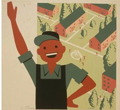
Do your organization’s online spaces reflect its onsite vibe?
I have been volunteering for Red Cross blood drives. Often, these take place in fellowship halls of churches. One was remarkable to me: the space was full of welcoming symbols and social justice messaging. The message was: “We’re so happy you are here, no matter who you are.” Later looked at the church web site, and was stunned to see that the onsite messaging wasn’t similar – that welcoming feeling was not also there online.
Do your organization’s onsite spaces reflect what you do well online?
I’ve also seen the opposite: a web site full of images of people and messaging that make me think, wow, this organization really cares about people and really makes a difference. And really wants me to be a part of it! But onsite, when you enter, those images, or similar images, are no where to be found, the mission statement isn’t in big bold letters in the lobby, and the first employee or volunteer I encounter when I walk in doesn’t make me feel welcomed – I feel like I’m bothering the person by being there.
Potential and current clients, customers, donors and volunteers want to feel like you want them to be there, onsite or online. They want to feel welcomed. They want the space to be accessible. They want the doors to open easily and the web site to load quickly. They want to know where to find things in your lobby and on your web site.
No need to hire a consultant: just ask a friend to walk into your space to ask about volunteering. Ask another friend to go to your web site and look for information about volunteering. Ask more than one friends to do this. Ask them about the experience later. Did they feel encouraged? Enlightened? Discouraged? Confused?
Use the results to develop a strategy to improve both spaces, as needed.
In the case of your in-person, onsite space, it may mean reminding staff how to answer the phone or how to greet people when the come into your space. It may mean stopping by your local Habitat for Humanity ReStore and buying some picture frames and using them to display your mission, some photos from your program (clients or volunteers – but only if you have asked folks to sign a photo release!) and a QR Code allowing people to easily donate online using their cell phone. It may mean making sure someone in a wheel chair can easily enter your establishment, or someone using a walker can find a place to sit quickly in your lobby.
In the case of your online space… go over these resources with your web designer:
- If I can’t find what I’m looking for on your web site, who else can’t?
- Use Your Web Site to Show Your Accountability and To Teach Others About the Nonprofit / NGO / Charity Sector!
- REQUIRED Volunteer Information on Your Web Site.
- What should be on a nonprofit / NGO web site?
- What should be on a political web site.
- Focus on content as much as design!
- What Are Your Volunteers Saying?


